Ask any website designer and they will agree: the typefaces you choose on your website are as important as the design itself.
Given that all bar 5% of the internet is written language, when building a new website, the topic of type simply cannot be ignored.
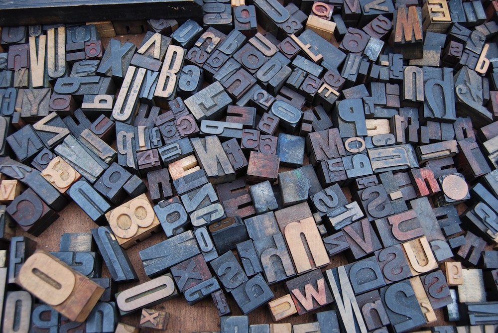
What’s the difference between typeface and font?
To those of us who aren’t design experts, it’s easy to confuse the terminology we use when talking about text.
Many people make the mistake of thinking typeface and font are interchangeable terms. To clear up this misconception, let’s find out the difference between the two.
A typeface is a group of characters, numbers and letters which all share the same design. To give you an example, Times New Roman, Arial and Comic Sans are all typefaces. (In fact, Comic Sans is considered the world’s most hated typeface).
A font, however, is a specific style of typeface which has a set width, size and weight. For example, Comic Sans is a typeface, but 12pt Comic Sans Bold is a font.
Typography refers to the overarching art of written language. There are other elements, besides typeface and fonts, which make up typography. These include line length, leading (the lines that letters “sit” on), kerning (the white space between letters/characters) and tracking (uniform spacing of characters).
We know it can be tempting to get carried away and include all the different typefaces your website builder offers. However, it’s worth noting that your design choices can and will affect your booking numbers.
Typography: best practice tips for your vacation rental website
You didn’t think we were going to tell you that the wrong typeface will cost you bookings, and not give you any pointers on how to improve – did you?
Read on to discover our top seven tips for choosing the right typefaces for your vacation rental website.
1. Use a maximum of 2-3 typefaces on your website
The design of your website is the first thing your visitors (and potential guests) will notice. You don’t want to scare them off with an overwhelming mix of different typeface styles that make for a messy, unprofessional appearance.
Less is more when it comes to typefaces.
Experts recommend using a maximum of two to three typefaces on your website, with each serving a different purpose.
The important thing to remember is that the two or three typefaces you choose should harmonize with one another across your site – rather than give users a headache.
Furthermore, it’s essential you stick to your selected typefaces. Continue to use the same two or three typefaces in any other material you produce, i.e. printed flyers or merchandise, banners on your website and so on.
2. Use a mixture of serif and sans serif – it’s OK!
There are two main categories of typefaces: serif and sans serif.
Serif typefaces are those which have decorative strokes that extend from letters and characters – for example, Times New Roman and Georgia. As some of the oldest around, classic serif typefaces usually evoke feelings of elegance, formality and confidence.
Sans (French for “without”) serif typefaces, in contrast, do not have strokes on their characters. Commonly used sans serif typefaces include Helvetica and Verdana. These more modern typefaces usually conjure up feelings of friendliness, cleanliness and minimalism.
Many designers choose to use a mixture of serif and sans serif typefaces across websites to create diversity. If you are going to do this, remember to keep your website consistent and coherent. You could try using a serif for your headers and a sans serif for the body text – test different combinations until you find the one that looks best.
3. Make sure your typefaces work well in different sizes
An increasing number of guests are turning to their handheld devices to research and book travel, that’s why your website absolutely has to meet their needs. The typefaces you decide on should work just as well on a smaller screen as they do on a larger one, so ensure you pick styles that maintain readability and usability no matter the size.
4. But, try to keep sizes large – it’s easier on the eyes
Marketing Land regularly sees a 30% improvement in bounce rate and time on site after increasing font size, and Click Laboratory noted a huge 133% improvement in form conversion rate after increasing the font size from 10pt to 13pt.
An in-depth study concluded that 16 pixels is the optimum size for website copy, given that most users sit around 20 to 23 inches from their computer screens.
Also, bear in mind the average age of your website visitors and guests. 40-year-olds have to work twice as hard to read as 20-year-olds, and for those who are closer to 60, it’s four times as difficult to read.
5. Avoid choosing an all-capital style
While capital lettered text is acceptable in certain situations, in general, if you want users to read your content, you should avoid forcing them to read long passages of capitalized text.
All-capital typefaces slow down scanning and reading time considerably when compared with lower-case versions.
What’s more, capitalized text online is often associated with shouting, angriness and frustration – emotions you do not want to display when trying to convert guests!
6. Keep a good color contrast ratio
Another common web design error is mistaking the use of similar colors for both text and background as “harmonious”. When considering usability, the more the text pops on the page, the easier and quicker your potential guests will be able to read it to find the information they need.
Large text will ideally have a contrast ratio of minimum 3:1 compared with the background. There are free tools you can use to check the ratio of your color choices.
When choosing typefaces for your vacation rental website, the number one thing to remember is that typography should always complement your content. You want potential guests to remember the messages you write, rather than which typeface you used. That said, it’s essential you create some guidelines to define the purpose of each typeface – and stick to them!