
Color can have a huge effect on our perception of a product, campaign or – you guessed it – vacation rental. That’s why choosing the right colors for your vacation rental website can help boost conversion and secure more bookings. The “wrong” combinations, however, can have a negative impact on your prospective guests’ decision-making.
Color psychology isn’t limited to offline activities such as interior design, but it can also apply to your brand and be extended to your website.
The Logo Company’s color emotion guide infographic (above) pulls together some of the world’s most recognizable brands and analyzes their color usage.
Yellow tends to convey emotions of warmth and optimism, whereas orange is creative and enthusiastic. Using red is a signal of a bold and exciting brand, but purple is regal, imaginative and wise. Interestingly, blue is the most popular color for both men and women, as it is calming and can provoke emotions of strength and dependability. Green can signify growth, but can also be interpreted as a peaceful color due to its close links with the environment.
![]()
When deciding on your vacation rental website color scheme, there isn’t a magic formula that can 100% guarantee success and bookings. That said, we do have some ideas on the best practices you can follow to grab a potential guest’s eye.
1. Use your brand colors as the base
If you already have a brand or have at least started working on it, this is the most obvious place to start with your website color palette.
“The link between color and brand identity is strong,” says Canva in their article about color psychology and logos. Applying the same colors across your website will promote consistency and recognizability of your brand.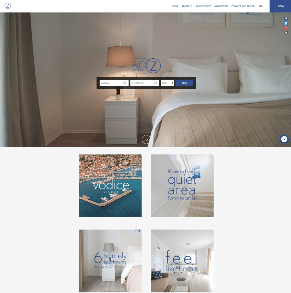
APOZ vodice apartments in Croatia are luxury and sleek, situated in beach locations. This is not only reflected in their business branding with blue-purple accents and sandy tones, but also in the properties themselves and their decoration.
2. Direct your color scheme to your target audience
Studies have shown many differences between the colors that men and women prefer, so if you market your rental to couples – you might want to bear this in mind. Around 57% of men say that blue is their favorite color, along with 35% of women – making it the strongest preference across the board. Curiously, 23% of women enjoy the color purple, but almost the same percentage of men state it as their least favorite.
Similarly, if families with young kids are your target demographic, think about using more playful colors to show off your property’s child-friendliness.
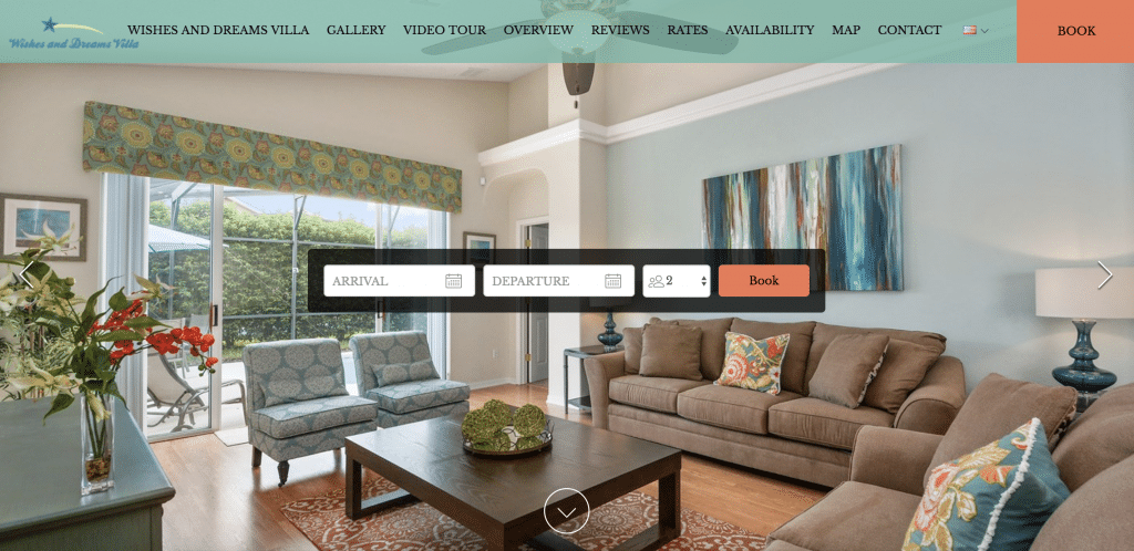
Wishes and Dreams Villa use a lively fusion of orange and turquoise across their site to appeal to families.
3. Use the 60-30-10 rule
Crazy Egg suggests that using a minimum of three colors is good practice across any website. But how do you work out how much color to put where? That’s where the 60-30-10 rule comes in.
For those who are unfamiliar with it, the 60-30-10 rule originates from interior design principles. The 60% is the main color for a room, the color that anchors the space and determines the unifying theme. The 30% refers to the secondary color of your palette – it supports the main color, but is contrasting enough to create interesting visual elements. Finally, the 10% is the accent color – those eye-catching hues and tones which complement your primary or secondary color and stand out against them.
While we can apply this ideology to website design, it’s not the same as designing a home. Although certain colors work well for call-to-actions on websites, they would be an eyesore for home interiors. In this sense, you have a much bigger range of colors to play with.
4. Think about your location (and competition!)
A lot of design inspiration comes from nature, and there’s no reason you can’t follow suit for your website. Matching your website color scheme to the landscapes found in your local area can help your brand to be memorable and instantly recognizable for guests who are visiting from elsewhere.
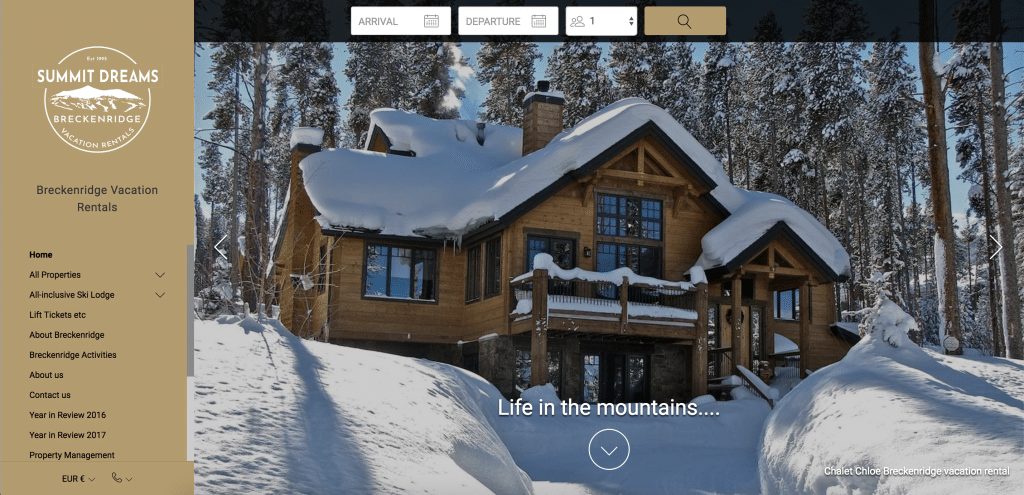
Summit Dreams in Breckenridge, Colorado use a harmonizing palette of neutral, earthy tones found in and around the ski resort where their rentals are located. This color combination can also help the website to stand out from its competition, who tend to use blues and whites (sky and snow colors) to advertise their properties in popular ski areas.
5. Save your accent color for the call to action
The accent color or “10%” works best to highlight the most important features on your site. In many cases, for vacation rentals, this is the call-to-action or “Book Now” button.
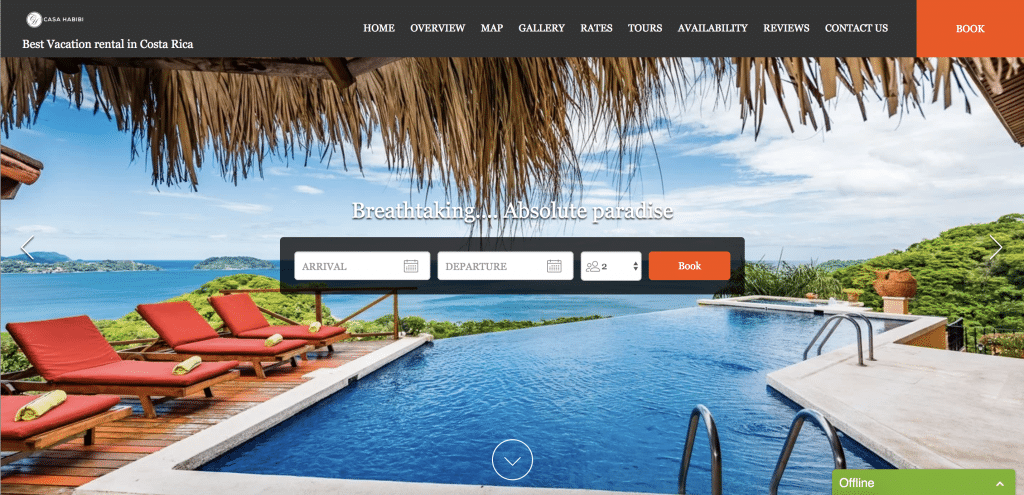
A contrasting, yet matching, color button will stand out from the rest of your site and persuade your visitor to click through to make their booking. Take a look at Casa Habibi for inspiration!
Ideally, the placement of this button will be in the top right-hand corner (think about online shopping – the cart is always there and for a good reason), or in the middle-right of the page. In addition to this, all call-to-action buttons that you want guests to click on should be in the same color across your site. This will ease navigation and help prevent potential guests from feeling overwhelmed when browsing your vacation rental offerings.
6. Ensure background colors and text contrast enough
Whether your potential guests are browsing your website on a desktop or mobile devices, one thing is certain: the text needs to be legible. You can achieve this on your website by ensuring there is a high contrast between the text color and background color you use. The combinations which are most easy-to-read would be either a dark text color on a light background color, or light text on a dark background.
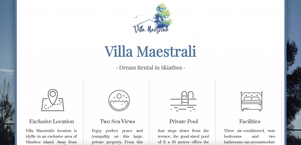
While Villa Maestrali has a photo of the property in the background of the website, the text is still easy on the eyes thanks to the white overlay and gray color text.
These pointers are just the basics for starting to build your new vacation rental website and deciding its color scheme. For more in-depth information on improving your website for booking conversion, watch our webinar about the Anatomy of the Perfectly Optimized Vacation Rental Website!